

 Subscribe
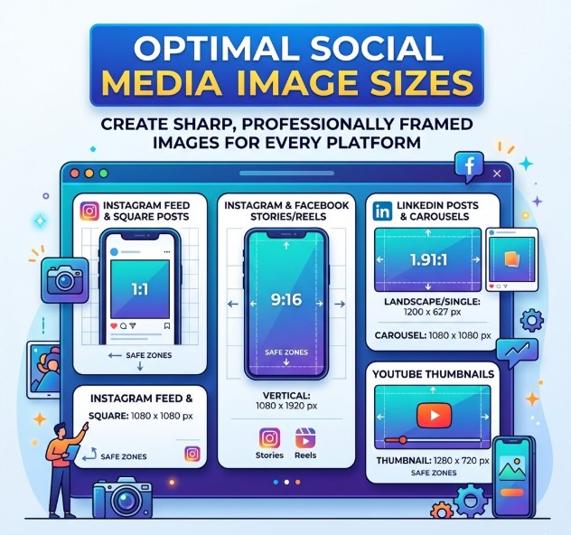
You can design a clean, sharp, good-looking image, upload it to a social platform, and still end up with something that looks… wrong.
Maybe the top of the banner gets cut off. Maybe the text looks fine in your design tool, but becomes almost unreadable on mobile. Maybe your logo sits too close to the edge and gets covered by buttons, captions or profile elements. Or maybe the image just looks blurry after upload, even though the original file seemed fine.
That is why social media image sizes still matter. Not because every post needs to be designed with mathematical perfection, but because each platform has its own layout, crop behaviour and preferred aspect ratios. A square image, a vertical Story, a YouTube thumbnail and a LinkedIn banner are not the same job. They need different space, different composition and sometimes completely different versions of the same creative.
This guide is built to help you choose the right image size for social media without overthinking every single pixel. You will find recommended dimensions, aspect ratios, safe zone advice, file format tips and a practical checklist you can use before publishing.
For organic posts, these recommendations will usually be enough to avoid the most obvious problems. For paid campaigns, it is still smart to check the latest platform specs before launch, starting with the official Meta Ads Guide for Facebook and Instagram placements. A visual that looks fine in a normal feed may behave differently in Stories, Reels, Shorts or paid placements.
The goal is simple: to help your images look clear, sharp and properly framed wherever they appear.
In this guide
This guide is designed to help you find the right section quickly. You can start with the quick size table, go directly to a specific platform, or use the practical sections on safe zones, file formats and image quality before publishing.
- Quick social media image size cheat sheet
- Key image ratios: 1:1, 4:5, 9:16 and 16:9
- Image sizes for Instagram, Facebook, LinkedIn, X / Twitter, TikTok, YouTube and Pinterest
- Safe zones for Stories, Reels, TikTok and other vertical formats
- Best file formats for social media images
- Why images lose quality after upload
- How to resize one image for multiple platforms
- Common image size mistakes to avoid
- Final checklist before publishing
- FAQ
Why Do Social Media Images Look Cropped, Blurry or Wrong After Upload?
Most image problems on social media come from one simple thing: the design was made for the wrong display environment.
An image may look perfect in Canva, Figma or Photoshop, but the platform does not show it in the same clean workspace. It appears inside a feed, a profile, a mobile screen, a preview card, a Story, a Reel, a carousel or an ad placement. Each of these spaces has its own limits.
A common issue is cropping. This happens when the image ratio does not match the space where it appears. For example, if you upload a horizontal image into a vertical-first placement, the platform may crop the sides, zoom the image or leave awkward empty space. The result is usually not what you planned.
Another common problem is blur. This often happens when the original image is too small, too compressed or stretched into a larger format. A 600 px image may survive in one placement, but look weak on a larger screen or inside a high-resolution mobile display.
Then there are interface elements. Stories, Reels, TikTok videos and some ad formats have buttons, captions, usernames and interaction icons placed over the content. If your text, logo or call-to-action is too close to the edge, it may still be technically inside the image, but practically invisible.
So the real question is not only:
What size should this image be?
The better question is:
Where will this image appear, how will it be cropped, and what needs to stay visible?
That is the mindset behind the rest of this guide.
What Is the Best Image Size for Social Media?
There is no single best image size for every social media platform. A size that works well for an Instagram feed post may not work for a YouTube thumbnail, a LinkedIn banner or a TikTok creative.
Still, there are a few formats that cover most social media design work. If you understand these formats, choosing the right image size for social media becomes much easier.
| Format | Best use |
|---|---|
| 1:1 | Square posts, profile-style visuals, simple feed graphics |
| 4:5 | Vertical feed posts, especially mobile-first content |
| 9:16 | Stories, Reels, TikTok, YouTube Shorts and full-screen vertical ads |
| 16:9 | YouTube thumbnails, video previews, link images and horizontal creatives |
If you are creating one image and hoping to use it everywhere, start with the content goal first. Is it a feed post? A Story? A video thumbnail? A profile banner? A paid ad?
For most brands and creators, the safest workflow is to create several versions of the same idea instead of forcing one image into every platform. A vertical version can be used for Stories, Reels and TikTok. A 4:5 version can work better in feeds. A 16:9 version is useful for video thumbnails and previews.
This does not mean you need to design everything from scratch every time. But it does mean the same visual should usually be adapted, not just copied and uploaded everywhere.
A good rule is simple: design for the placement, not just for the platform. Instagram alone can include square posts, portrait posts, Stories, Reels, carousel previews and ads. Facebook, LinkedIn and TikTok also show creative differently depending on where it appears.
So the best size is the one that matches the space where the image will actually be seen.
For a wider cross-platform reference, the Hootsuite social media image sizes guide is also useful, because it tracks recommended dimensions across major platforms and helps you compare formats before creating final visuals.
Read also: Why UI/UX Design Is Essential for Business Growth
Quick Social Media Image Size Cheat Sheet
Use this table as a quick starting point. These are practical recommended sizes, not a replacement for checking official ad specs before launching paid campaigns.
| Platform | Image type | Recommended size | Ratio |
|---|---|---|---|
| Feed portrait | 1080 x 1350 px | 4:5 | |
| Stories / Reels | 1080 x 1920 px | 9:16 | |
| Feed image | 1200 x 630 px | 1.91:1 | |
| Stories / Reels | 1080 x 1920 px | 9:16 | |
| Feed image | 1200 x 627 px | 1.91:1 | |
| X / Twitter | In-stream image | 1600 x 900 px | 16:9 |
| TikTok | Vertical creative | 1080 x 1920 px | 9:16 |
| YouTube | Thumbnail | 1280 x 720 px | 16:9 |
| Standard Pin | 1000 x 1500 px | 2:3 |
For organic posts, this table will usually be enough to avoid the most obvious problems. For ads, always check the platform’s own specifications, because campaign placements can use different rules than regular posts.
The Sprout Social image sizes guide is a useful extra reference if you want to compare updated dimensions across several platforms before preparing your final set of visuals.
Still, do not treat any cheat sheet as a one-click answer for every design. A feed post, a Story, a banner and a thumbnail all have different jobs. The table helps you start with the right canvas, but the final image still needs to be checked for crop, readability and mobile display.
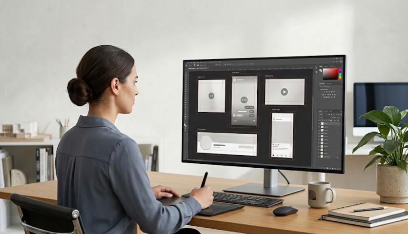
The Four Image Ratios You Should Understand First
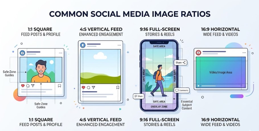
Before you resize anything, it helps to understand the four ratios that appear again and again across social media. The exact pixel size can change from one platform to another, but the shape of the image is usually what decides whether it fits naturally or gets cropped.
1:1 Square Images
A 1:1 image is simple and flexible. It works well for square feed posts, profile-style visuals, quote graphics, product images and basic brand updates. It is not always the most attention-grabbing format on mobile, but it is still useful when you want a clean, balanced layout.
The biggest advantage of a square image is predictability. It is easy to adapt, easy to preview and usually safe for multi-platform posting. But you still need to keep text readable. A square image can look neat in a design tool and still feel cramped in a mobile feed if the text is too small.
4:5 Vertical Feed Images
A 4:5 image gives you more vertical space without becoming a full-screen Story or Reel. This is one of the most useful formats for feed content because it takes up more room on a phone screen than a square post.
For brands, creators and social media teams, 4:5 is often a strong choice for announcements, product visuals, educational posts and campaign graphics. It gives enough space for a headline, an image and a small brand element without feeling too stretched.
9:16 Full-Screen Images
A 9:16 format is made for vertical mobile content. Use it for Stories, Reels, TikTok, YouTube Shorts and other full-screen placements.
This format looks simple, but it is where many mistakes happen. Because the content fills the whole screen, platforms often place buttons, captions, usernames and engagement icons over the image or video. That means the full 1080 x 1920 canvas is not always a safe area for text or logos.
When working with 9:16 content, treat the centre of the image as the safest area. Keep important text, faces, logos and calls-to-action away from the very top and bottom.
For vertical ad placements, TikTok Creative Best Practices is a useful reference because it explains why key elements should stay visible inside the platform’s safe zone.
16:9 Horizontal Images
A 16:9 image is the classic horizontal format. It is common for YouTube thumbnails, video previews, link images, webinars, presentation-style graphics and some X / Twitter posts.
The main challenge with 16:9 is mobile readability. A thumbnail or preview may look good on a desktop screen but become very small in a feed. If you use text, it should be short, bold enough and easy to understand at a glance.
This ratio is not dead, but it should be used for the right job. For vertical-first platforms, 16:9 often feels too wide and may lose impact compared with 4:5 or 9:16 formats.
Read also: 10 Website Growth Hacks to Boost Sales and Rank Higher
Instagram Image Sizes
Instagram is one of the easiest platforms to misunderstand, because one image can appear in several different ways. A post may look good in the feed, but not as strong in the profile grid. A Reel cover can look fine full-screen, then feel awkward when cropped into a preview. A carousel also follows the ratio of the first image, so the first slide sets the frame for everything that comes after it.
For most Instagram content, you should think in three basic directions: square, vertical feed and full-screen vertical.
| Image type | Recommended size | Ratio |
|---|---|---|
| Profile image | 320 x 320 px or higher | 1:1 |
| Square post | 1080 x 1080 px | 1:1 |
| Portrait post | 1080 x 1350 px | 4:5 |
| Landscape post | 1080 x 566 px | 1.91:1 |
| Stories / Reels | 1080 x 1920 px | 9:16 |
For feed posts, 1080 x 1350 px is often a strong choice because it gives the image more vertical space on mobile. It works well for product shots, educational posts, campaign visuals and simple branded graphics. Square posts are still useful, especially for cleaner layouts or content that may be reused across platforms.
Stories and Reels need more care. The full canvas may be 1080 x 1920 px, but that does not mean every part of the image is equally safe. Keep text, logos and important details away from the very top and bottom. Buttons, captions and profile elements can sit over the content, especially on mobile.
For Instagram ads and paid placements, check the Meta Ads Guide before publishing, because the recommended creative specs can change depending on objective, placement and format.
If you are preparing a carousel, keep all slides in the same ratio. Mixing portrait, square and landscape images inside one carousel usually creates awkward crops or inconsistent framing. It is better to decide the format first, then design every slide around that same canvas.
Facebook Image Sizes
Facebook has more image placements than many people expect. A profile image, a cover photo, a feed image, a Story, a Reel, an event banner and a group cover do not behave the same way. Even if they all belong to the same platform, they need different dimensions and a different layout.
The biggest mistake with Facebook is treating it like one fixed canvas. It is not. Some images are shown wide, some are cropped for mobile, and some appear inside busy feeds where the design has only a second to make sense.
| Image type | Recommended size | Ratio |
|---|---|---|
| Profile image | 170 x 170 px minimum | 1:1 |
| Cover photo | 820 x 312 px desktop / 640 x 360 px mobile | variable |
| Feed image | 1200 x 630 px | 1.91:1 |
| Stories / Reels | 1080 x 1920 px | 9:16 |
| Event cover | 1200 x 628 px | 1.91:1 |
| Group cover | 1640 x 856 px | about 1.91:1 |
For Facebook feed images, 1200 x 630 px is still a practical starting point, especially for shared visuals and link-style posts. It gives enough width for a clean preview and works well with horizontal layouts.
Cover photos need more attention. A Facebook cover can appear differently on desktop and mobile, so avoid placing important text, logos or faces near the edges. Keep the main subject closer to the centre. This is especially important for business pages, where the cover image often carries a campaign message, product visual or brand positioning.
Stories and Reels follow the same vertical logic as other mobile-first formats. Use 1080 x 1920 px, but keep the important parts inside a safe central area.
For Facebook ads, boosted posts and paid placements, check the Meta Ads Guide before publishing. Organic post sizes are useful for everyday content, but ad specs can vary by objective and placement.
LinkedIn Image Sizes
LinkedIn is less forgiving than casual platforms, because the image often works as part of your professional identity. A blurry banner, stretched company logo or poorly cropped post can make a profile or brand page feel unfinished.
At the same time, LinkedIn does not need overly complicated visuals. Clear composition, readable text and correct sizing usually matter more than heavy design. The goal is to look professional, not crowded.
| Image type | Recommended size | Ratio |
|---|---|---|
| Profile image | 400 x 400 px | 1:1 |
| Personal background | 1584 x 396 px | 4:1 |
| Company logo | 300 x 300 px | 1:1 |
| Feed image | 1200 x 627 px | 1.91:1 |
| Company cover | 1128 x 191 px | wide |
For personal profiles, keep the face or main subject centred in the profile photo. LinkedIn crops profile images into a circle in many places, so corners are not reliable space for anything important.
The background image is different. It is wide and narrow, which means it can easily feel empty or too packed. Use it for a simple brand message, a clean visual theme or a soft background. Avoid long text. It will not read well on smaller screens.
For company pages, the logo should stay simple and recognisable even at a small size. If the logo has too much detail, consider using a simplified mark rather than the full version with small text.
For sponsored content, company page visuals and paid campaigns, check LinkedIn Marketing Solutions before publishing. LinkedIn placements can vary depending on the ad type, so it is better to confirm the format before preparing final creative.
X / Twitter Image Sizes
X is still often called Twitter in searches, so it is useful to think about both names when preparing content. The platform is fast, text-heavy and feed-driven, but images still matter a lot. A strong visual can make a post easier to notice, especially when people scroll quickly.
The main thing with X / Twitter is to keep images simple and readable. Small text, overloaded graphics and too many details usually do not work well in the feed. If the image needs explanation, the post itself should do part of the work.
| Image type | Recommended size | Ratio |
|---|---|---|
| Profile image | 400 x 400 px | 1:1 |
| Header image | 1500 x 500 px | 3:1 |
| In-stream image | 1600 x 900 px | 16:9 |
| Link card image | 1200 x 628 px | 1.91:1 |
The profile image should stay recognisable at a small size. If it is a brand account, use a clear logo mark rather than a detailed full logo with small text. For personal accounts, keep the face or main subject centred.
The header image is wide and narrow, so treat it more like a background than a poster. It can support your brand, campaign or message, but it should not carry too much important text. On different screens, edges may be less reliable than the central area.
For in-stream images, 1600 x 900 px is a practical size for horizontal visuals. It works well for announcements, blog previews, product shots and simple campaign images. If the post is text-heavy, make sure the visual does not repeat the same message in a crowded way.
For paid placements or promoted content, check the X Business Help Center before preparing final creative, because ad formats and requirements can differ from regular organic posts.
Read also: WordPress Marketing Tools: How to Grow Traffic, Leads, and Sales
TikTok Image and Video Sizes
TikTok is built around vertical mobile content, so the safest starting point is a 9:16 format. If your creative is horizontal or too crowded, it usually loses impact fast. The image or video may still upload, but it will not feel native to the platform.
For TikTok, size is only part of the job. You also need to think about what stays visible after the interface appears on top of the content. Captions, buttons, profile details and engagement icons can cover parts of the screen, especially near the edges.
| Content type | Recommended size | Ratio |
|---|---|---|
| Profile image | 200 x 200 px or higher | 1:1 |
| Vertical video / creative | 1080 x 1920 px | 9:16 |
| Cover image | 1080 x 1920 px | 9:16 |
For regular TikTok content, 1080 x 1920 px is the most practical format. It fills the screen, feels natural on mobile and gives enough resolution for clean visuals. If you are adding text, keep it short and place it away from the bottom and right side, where interface elements can make it harder to read.
The same logic applies to TikTok cover images. They should work both as a vertical visual and as a small preview. A cover with tiny text may look fine while editing, but become useless when shown in a grid or preview.
For ads, vertical creative is even more important. The TikTok Creative Best Practices page is the right reference here, especially for checking safe zones, resolution and mobile-first creative requirements before publishing.
In short: make TikTok visuals vertical, keep the message simple, and do not put anything important too close to the edges.
YouTube Image Sizes
YouTube images have a different job from most feed visuals. They are not just there to decorate a post. A thumbnail can influence whether someone clicks the video at all, and a channel banner helps shape the first impression of the page.
That means YouTube visuals should be designed for clarity first. A thumbnail may be shown large on a TV screen, medium-sized on desktop and very small on mobile. If the text or main subject only works at full size, it probably needs to be simplified.
| Image type | Recommended size | Ratio |
|---|---|---|
| Profile image | 800 x 800 px | 1:1 |
| Channel banner | 2560 x 1440 px | 16:9 |
| Video thumbnail | 1280 x 720 px | 16:9 |
| Shorts cover | 1080 x 1920 px | 9:16 |
For thumbnails, 1280 x 720 px is the standard working size. Keep the image clear, high-contrast and easy to understand quickly. Avoid long text. A few strong words usually work better than a full sentence.
For channel banners, the design needs to work across devices. YouTube can display banner art differently on TV, desktop and mobile, so important elements should stay closer to the centre. Treat the edges as flexible space, not as a safe place for important text or logos.
Shorts are different again. They belong to the vertical content world, so a 9:16 frame is more natural. If you create a Shorts cover, keep the central subject strong and do not rely on small details.
For thumbnails, check the official YouTube thumbnail requirements. For channel art and profile visuals, use the YouTube channel branding guidelines before uploading final files.
Pinterest Image Sizes
Pinterest works differently from fast feed platforms. People often use it to search, save and return to ideas later, so the image has to be clear even when it appears as a small preview among many other Pins.
Vertical images usually perform better on Pinterest because they take up more space in the feed and feel more natural inside the platform. A very wide horizontal image can look weak there, while an extremely long image may be cropped or feel difficult to scan.
| Image type | Recommended size | Ratio |
|---|---|---|
| Profile image | 165 x 165 px | 1:1 |
| Board cover | 222 x 150 px | wide |
| Standard Pin | 1000 x 1500 px | 2:3 |
| Square Pin | 1000 x 1000 px | 1:1 |
For standard Pins, 1000 x 1500 px is a strong starting point. It gives you enough vertical space for the main visual, a short headline and a small brand element without making the design feel too heavy.
If you use text on a Pin, keep it short and readable. Pinterest users often scan quickly, so a clean message usually works better than a crowded design. The image should explain the idea fast, but it should not try to hold an entire article inside one graphic.
Board covers are smaller and less flexible, so they should be simple. Use a recognisable image, brand colour or visual theme rather than detailed text.
For promoted content and paid campaigns, check the official Pinterest product specs before preparing final creative, especially if you need to confirm file types, dimensions or ad requirements.
Threads, Snapchat and Other Platforms
Instagram, Facebook, LinkedIn, X, TikTok, YouTube and Pinterest will cover most social media image needs. Still, some brands also publish on Threads, Snapchat, Bluesky, Reddit or other community-driven platforms.
This section does not need to become another long list of every possible size. The better approach is to use the same design logic: understand the placement, choose the right ratio, and keep important elements away from risky edges.
For Threads, simple feed-style images usually work best. Square or vertical images are easier to scan, especially when the post is part of a longer conversation. Avoid designs that depend on very small text.
For Snapchat, vertical 9:16 content is the natural format. Like TikTok, Reels and Stories, Snapchat content lives on a mobile screen, so safe zones matter. Keep text, logos and calls-to-action closer to the centre and away from interface elements.
For platforms like Bluesky or Reddit, the best image size depends more on context. A community post, link preview, meme-style image or discussion graphic may all behave differently. The safest rule is to upload a clear image at a strong resolution, then preview how it appears before publishing.
Do not chase every platform with a separate design system unless your audience is really active there. For most teams, it is enough to prepare strong versions for 1:1, 4:5, 9:16 and 16:9, then adapt only when a platform needs something special.
Read also: Google Tag Manager for WordPress: How to Set Up and Track What Actually Matters
What Are Safe Zones and Why Do They Matter?
A correct image size does not always mean the image will display correctly. This is especially true for vertical formats, where the platform interface sits on top of the content.
A safe zone is the part of the image where important elements are least likely to be covered, cropped or pushed out of view. In practice, this means your headline, logo, face, product, price, call-to-action or key message should not sit too close to the top, bottom or side edges.
This matters most for Stories, Reels, TikTok videos, YouTube Shorts, Snapchat content and vertical ads. These formats often include usernames, captions, buttons, icons, progress bars or engagement controls. The image may be the right 1080 x 1920 px size, but if the CTA is sitting under a button, the design still fails.
Safe zones are not only about avoiding technical mistakes. They also make the visual easier to read. A design with breathing space around the main message usually feels cleaner and more professional than one where every corner is filled.
A simple rule works well: keep the most important content near the centre, and treat the outer edges as risky space. Background colours, simple patterns or non-essential visual details can go near the edges. Text, logos and calls-to-action should stay inside the safer central area.
For vertical ads and mobile-first creative, TikTok Creative Best Practices is a useful reference because it explains why key elements should stay visible inside the platform’s UI safe zone.
Best File Formats for Social Media Images
Choosing the right size is important, but the file format also matters. A good image can still lose quality if it is exported in the wrong format, compressed too much or uploaded as a file that does not suit the content.
For most social media images, the choice is usually simple:
| Format | Best for |
|---|---|
| JPG | Photos, lifestyle images, regular feed posts |
| PNG | Logos, graphics, text-heavy visuals, transparent backgrounds |
| WebP | Lightweight web images, where supported |
| GIF | Simple animations, when the platform supports them |
| MP4 / MOV | Video posts, Stories, Reels, TikTok and Shorts |
JPG is usually the safest option for photos. It keeps file sizes reasonable and works well for lifestyle images, product shots and regular feed content. Just avoid saving the same JPG again and again, because repeated compression can slowly reduce quality.
PNG is better for graphics, logos, icons and images with sharp text. If your visual includes a lot of clean lines, brand elements or transparent areas, PNG is often the better choice. The file may be larger, but the result usually looks cleaner.
WebP can be useful for web pages and lightweight assets, but not every social platform treats it the same way. If you are not sure, JPG or PNG is usually safer.
For motion content, use video formats like MP4 or MOV instead of trying to force animated content into an image format. Reels, Stories, TikTok videos and YouTube Shorts should be prepared as proper vertical video files, not as oversized animated GIFs.
The main rule is simple: use JPG for photos, PNG for sharp graphics, and video formats for moving content. Then export at the correct size instead of uploading a tiny file and expecting the platform to fix it.
Why Images Lose Quality After Upload
Sometimes the size is technically correct, but the image still looks worse after upload. This is one of the most frustrating parts of social media design, because the original file may look sharp on your computer, then appear soft, pixelated or slightly muddy in the feed.
The first reason is usually resolution. If the original image is too small, the platform has to stretch it or display it in a larger space than it was made for. That is when edges become soft and details start to fall apart.
The second reason is compression. Social platforms often compress uploaded images to make them load faster. A clean photo may survive this well, but a graphic with small text, thin lines or detailed logos can lose quality more noticeably.
Another issue is repeated exporting. If you save a JPG, edit it, save it again, then upload it later, the image may already be carrying compression damage before the platform even touches it.
Text size also matters. A headline that looks readable in a design file may become too small once the image appears inside a mobile feed. This is especially common with infographics, carousel slides and promotional graphics that try to include too much information.
To keep images sharp, start with a large enough source file, export at the recommended dimensions, avoid unnecessary compression and keep text simple. If the image includes a logo or important text, preview it on mobile before publishing. That one small check can save a lot of bad-looking posts.
How to Resize One Image for Multiple Platforms
One of the best ways to save time is to start with one strong master creative, then adapt it into the formats you actually need. But “adapt” is the important word here. Do not just crop the same image randomly and hope it works everywhere.
A good master creative should have enough space around the main subject, a clear focal point and no important text sitting too close to the edges. This gives you room to create square, vertical and horizontal versions without destroying the layout.
| Master version | Adapted version | Best use |
|---|---|---|
| 1080 x 1920 | 9:16 | Stories, Reels, TikTok, Shorts |
| 1080 x 1350 | 4:5 | Instagram / Facebook feed |
| 1080 x 1080 | 1:1 | Universal feed post |
| 1280 x 720 | 16:9 | YouTube thumbnail, video preview |
Start with the most important placement. If your main campaign is built for TikTok or Reels, design the 9:16 version first. If the main asset is a YouTube video, start with the thumbnail. If it is a feed campaign, 4:5 may be the better first version.
After that, create the other versions manually. Move the subject, adjust the text, resize the logo and check the safe area. A proper resize is not only about changing canvas dimensions. It is about making the image feel like it was designed for that placement.
Tools like Canva, Adobe Express and Figma can help with this. Canva and Adobe Express are useful for quick resizing and templates. Figma is better when you work with reusable layouts, brand systems or several versions of the same campaign.
Before publishing, open each version and ask one simple question: does this image still make sense in this format? If the answer is no, resize is not enough. You need to redesign the layout.
Common Social Media Image Size Mistakes
Most image problems are not caused by one tiny technical detail. Usually, they happen because the same visual is forced into too many places without checking how it will actually appear.
One common mistake is using one image size for every platform. It feels efficient, but it rarely works well. A horizontal image may look fine as a YouTube thumbnail and completely wrong in a Story. A square post may work in a feed, but feel weak in a vertical-first placement.
Another mistake is placing text too close to the edges. This is especially risky for Stories, Reels, TikTok and other full-screen formats. The image may not be cropped, but buttons, captions or icons can still cover the message.
Low-resolution images are also a problem. If the file is too small, the platform cannot magically make it sharp. It may stretch, compress or display the image in a way that makes it look soft.
Some teams also forget to check mobile preview. This is a big one. Most social media content is seen on phones, so a design that only looks good on desktop is not finished yet.
Text-heavy images are another weak point. If the image tries to explain too much, it becomes difficult to read. A social media visual should usually support the message, not carry the entire message by itself.
The safest approach is simple: design for the placement, keep important elements away from the edges, export at the right size, and preview the image before publishing.
Need Help Creating Social Media Visuals That Look Right Everywhere?
Choosing the right image size is only one part of the job. Your visuals also need to feel clear, consistent and easy to understand across feeds, Stories, ads, thumbnails and mobile screens. That is where design, structure and the right digital setup make a real difference.
If your brand needs cleaner layouts, better visual consistency or a more professional online presence, our UI/UX Design team can help you create visuals and page elements that are easier to read, easier to use and better adapted to real users.
For businesses that want to improve the full digital experience, not just individual images, our Web Development service can help build faster, cleaner and more reliable websites where social media traffic lands after the click.
And if you want to make content production, campaign workflows or creative testing more efficient, our AI Integration solutions can support smarter processes without making your brand feel generic.
Good social media design is not only about pixels. It is about how people see, understand and trust your brand, from the first image to the final action.
Final Checklist Before Publishing a Social Media Image
Before you publish, take one last look at the image in the place where people will actually see it. Not only inside your design tool.
Check the basics first: the image size, the ratio and the file format. Make sure the visual is not stretched, compressed too much or exported from a tiny source file.
Then check the layout. Is the main text readable on mobile? Is the logo inside the safe area? Are faces, products or calls-to-action too close to the edge? If this is a Story, Reel, TikTok video or ad, remember that buttons and captions may sit over the creative.
For important campaigns, do not rely only on memory. Check the official platform specs before publishing. A small mistake in size or crop can make a good design look unfinished.
FAQ
What is the best image size for social media posts?
There is no single best size for every platform, but 1080 px wide is a good starting point for many feed posts. For square posts, use 1080 x 1080 px. For vertical feed posts, 1080 x 1350 px often works better. For Stories, Reels, TikTok and Shorts, use 1080 x 1920 px.
Why do social media images get cropped?
Social media images usually get cropped when the image ratio does not match the placement. A horizontal image may be cropped in a vertical space, while a square image may not use enough screen space in a full-screen format. Cropping can also happen when text, logos or faces are placed too close to the edges.
Why do images look blurry after uploading?
Images often look blurry after upload because the original file is too small, too compressed or exported in the wrong format. Social platforms also compress images after upload, so small text, thin lines and detailed logos can lose sharpness. To avoid this, export at the recommended size and check the image on mobile before posting.
Can I use the same image for every social media platform?
You can use the same idea, but not always the exact same image. A better approach is to adapt one creative into several formats: 1:1 for square posts, 4:5 for vertical feed posts, 9:16 for Stories and Reels, and 16:9 for thumbnails or video previews.
What is a safe zone in social media design?
A safe zone is the part of the image where important content is less likely to be covered, cropped or hidden by platform elements. It matters most for vertical formats like Stories, Reels, TikTok videos and Shorts. Keep text, logos, faces and calls-to-action closer to the centre.
What is the best file format for social media images?
JPG is usually best for photos and regular feed posts. PNG is better for logos, graphics, text-heavy visuals and transparent backgrounds. For moving content, use video formats like MP4 or MOV instead of animated GIFs when possible.
How do I make social media images look good on mobile?
Design with mobile first. Use the right ratio, keep text large enough to read, avoid placing important elements near the edges and preview the image on a phone before publishing. If the image looks clear on mobile, it will usually work better across the platform.